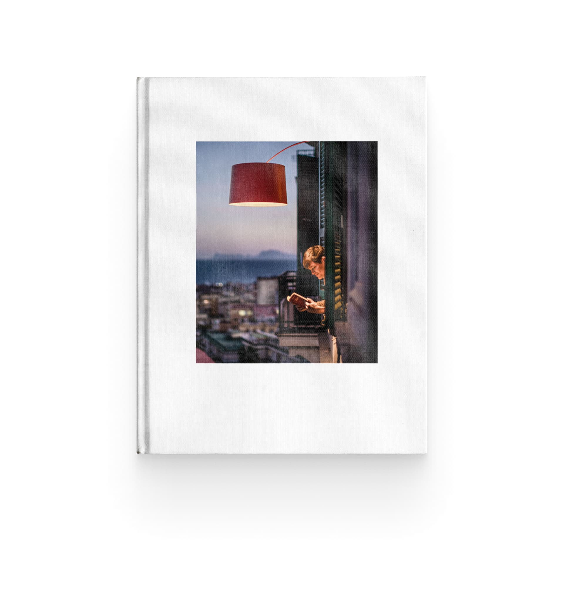
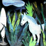
Doodling with light: in Ery Burns’ art, every detail tells a story.

Ery Burns brings the free-flowing spontaneity of doodling to Foscarini’s What’s in a Lamp? project. In each illustration, light becomes an immediate and imaginative expression, giving life to unexpected stories filled with intricate details, bold colors, and a touch of humor.
Ery Burns is a British artist and illustrator with a distinctive style—spontaneous lines, vibrant colors, and intricate patterns. She often says she inherited her doodle gene from her great-great-great-grandmother, an Indian artist who grew up in the foothills of the Himalayas. Her drawings emerge from intuition, taking shape directly on the page without a predefined structure, in a flow that weaves together organic forms, repeating patterns, and a hint of irony. The result is a visual universe that shifts between imagination and reality, evoking that childlike sense of wonder people tend to lose as they grow up.
For What’s in a Lamp?, Ery Burns reimagined Foscarini’s lamps through the lens of her creativity, exploring the emotional essence of light. She saw faces, creatures, and entire worlds waiting to emerge and brought them to life through her lines, allowing the shapes and volumes to guide her. Each lamp became a playful and hypnotic visual story, drawing the viewer in.

“I thought about what Foscarini lamps meant to me, and that feeling of comfort—finding a light in the darkness—came to me instantly. When I look at them, I see more than just objects that illuminate. I see worlds to explore, stories to tell, creatures hidden within their shapes. It’s as if each lamp has its own personality, ready to share its story.”
Ery Burns
/ Doodle Artist
In this interview, we talked to Ery Burns about her spontaneous approach to drawing and how she reinterpreted Foscarini’s lamps with her unmistakable style. Discover the full What’s in a Lamp? series on Instagram.
Can you share the journey that led you to become an illustrator? Were there pivotal moments that shaped your path?
I often say the same things in interviews as there are so many positive reasons why I love to draw, and I always like to come across as normal! The truth is, I grew up in a big family, and that doesn’t always guarantee that you’re not going to feel alone or be seen. I was the youngest of five, so I had a lot of colorful characters in my life and influences from older siblings, but my dad was a lawyer (and a workaholic), so he didn’t have that much time for us.
I remember that my crayons were like an escape where I could build worlds and exercise my imagination. It was like oxygen and helped regulate my emotions. Anytime I felt overwhelmed, I would disappear into my doodle art. So yes, the pivotal moment was escapism! Anytime I wanted to switch off, I would draw, which unfortunately included most of school… I’m terrible at math.
Your work is characterized by vibrant, highly detailed doodles filled with intricate patterns and bold colors. How did you develop this distinctive style, and what influences have shaped its evolution?
I always knew that maybe I had a unique way of making sense of the world. It was a subconscious process, but there were times as a kid when I would go through stages of being inspired by different artists or animations I came across.
I grew up watching Terry Gilliam films and Monty Python, and in the ’90s, Keith Haring and Basquiat were huge. I think they probably influenced me more than I realized. I also really liked Kandinsky, who shared my love of detail and bold lines.
Perhaps another factor was exposure to so much iconic music and vinyl artwork—my dad had the most amazing record collection: The Rolling Stones, Led Zeppelin, Bob Dylan, The Beatles, Cream. I also recently found out through DNA testing that I am 4% Indian and Kazakh, both super rich, colorful cultures. So I like to imagine that the Indian heritage I carry in my bones also plays a part in the evolution of my doodles and influences in my art.
Doodling is often associated with spontaneity and intuition. How much of your process is instinctive, and how much is deliberate composition following a clear vision you have from the start?
I think it depends on the brief, but usually, the first sketches will be completely spontaneous and just a lot of brain farts! When I was working on Foscarini, I did have a gut feeling about how I wanted it to look, but it was really just that—I couldn’t see it, but I could make sense of it before it was down on paper.
How do you decide when a piece is ‘finished’? Is there a moment when you feel it has reached its full potential?
I think you get a good feeling about the balance—how the illustration interacts with itself, whether it flows or feels too juxtaposed. Also, adding the color scheme can definitely make or break a piece.
I did have to bin one of the Foscarini artworks because it looked like a bad Jurassic Park. You just know when it feels right.
Could you walk us through your creative process when developing a pattern?
I’ll try! I do A LOT of sketches and research on Google, especially if I need to draw something more realistically. For things like beer can art or package designs, they need to really pop out and be noticed, so the weirder, the better. In this case, it means I can be more natural and delve into my subconscious more easily. I use a lot of random detail in my linework to knit the images together.
Are there recurring themes or structures that naturally emerge in your designs?
That’s a tough question. It’s usually quite a subconscious process that’s not always easy to explain. I usually start with a random shape, and it organically grows from a kind of ‘ery’ seed.
I think eyes always come up, and maybe hands, because that makes things seem more awake and connected. Perhaps I imagine they’ll get sad if they can’t see or touch. I guess I draw on evolution, humor, organic matter, and themes of nature.
Your work bursts with energy, vibrant colors, and dynamic compositions. How do you decide on your color palettes, and what role does color play in conveying the mood or message of a piece?
Color is so important, and it makes or breaks the mood of an artwork for sure. I think, like my style, the color palette I am drawn to is quite symbiotic with my illustration, and it’s totally intuitive when I use it.
It definitely depends on the brief and whether it’s more commercial or personal. Usually, my own work will be darker in color, with earthy hues that you might find in nature. For kids’ illustrations, I would probably be drawn to a bolder palette or lighter themes.
For the “What’s in a Lamp?” project with Foscarini, how did you conceptualize your illustrations? Were there specific aspects of the lamps that inspired your creative direction?
I think, first and foremost, I thought about what the lamps meant to me, and it was initially that feeling of comfort when you find a light in the darkness.
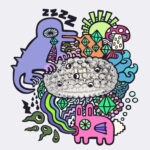
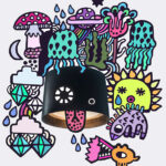
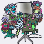
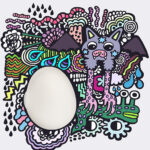
I looked at the shapes and materials of the lamps and saw faces, an egg, frogspawn, and water. So it was really about knitting all of these themes together and translating them into a magical piece of artwork that reflected the different personalities of the lights.
Many of your illustrations have a playful, almost hypnotic quality, drawing the viewer in for closer inspection. Do you see your art as a form of storytelling? If so, can you delve into the narratives you explored in your series for Foscarini?
I imagined the lamps kind of morphing into these little worlds they were living in, interacting with the characters, connecting in cool ways.
I liked the idea of people seeing the art as if they were just waking up, questioning whether they were half-dreaming or half-asleep. I really enjoyed working on Buds—it became such an inquisitive-looking lamp, I’m fascinated by it.
Equally, Gregg, I visualized as a freshly laid egg in my world, being nurtured by a bat-cat carrying a slug. I love them all, but my favorite is Twiggy, as it’s the most space-age with a touch of the 1960s about it and a good dose of rainbows. I like that it got away with sticking its tongue out—what a cheeky lamp.
Did this collaboration for Foscarini’s “What’s in a Lamp?” project present any unique challenges or opportunities?
I think the biggest challenge was not really having a brief to lean on—being handed total creative freedom, which is a rare thing. It was awesome to work on, but it just made you question yourself a lot more, as you hope that you are making the right decisions while bringing the best version of yourself to the table.
As an artist, how do you stay inspired and continue to evolve your work? Are there particular practices or experiences that fuel your creativity?
For me, staying inspired means keeping my body and mind as healthy as possible—listening to music, running in the woods, or going to my favorite club and dancing like a lunatic to DJ LMSKN.
I think it’s also about not getting too bogged down by social media and hung up on what everyone else is doing—dancing to the beat of your own drum, even in darker times.
In today’s digital age, how do you see the role of traditional illustration evolving? How do you balance digital tools with traditional techniques in your work?
I see it evolving into a niche way of working that hopefully a few of us will still be brave enough to carry on!
People often feel safer following the crowd, but working in traditional pen art from scratch is 100% slower from start to finish, so that can be a handicap. I like to digitize my work using a tablet, which is great because it keeps the ebbs and flows of my natural linework alive. The whole process just takes a little longer.
What does creativity mean to you?
It means being everything and nothing—a grain of sand in the universe.
Discover more about the collaboration with Ery Burns and the full series on Instagram @foscarinilamps. Explore all the works from the What’s in a Lamp? project, where international artists are invited to interpret light and Foscarini’s lamps.

After the interpretation of the luminator which led to the Chiaroscura lamp, Alberto and Francesco Meda rethink a lighting classic for Foscarini: the chandelier.

Francesca Lanzavecchia sa esattamente cosa vuole: progettare oggetti che non lasciano indifferenti. Non si tratta solo di estetica, ma di quell’intensa risonanza emotiva che i suoi progetti devono saper evocare. In un’intervista racconta Allumette e Tilia, i due chandelier che ha progettato per Foscarini.

Mattia Cimadoro and Giuseppe Mauro, who lead Dordoni Studio, talk in this interview about Etoile: a project that embodies an ethereal lightness and a restrained yet confident elegance, combined with a discreet and sophisticated ambient light.
Double event with Foscarini at Milan Design Week 2025: join us at Euroluce, Fiera Milano, and explore our showroom Foscarini Spazio Monforte.
Jim Stoten reimagines Foscarini lamps in a series of hypnotic, infinite-zooming animations that feel like gateways—inviting viewers to explore universes within universes and pulling them into vibrant worlds of color, form, and imagination.

Giona Maiarelli’s latest series for What’s in a Lamp? blends Italian and American cultures, using collages to reinterpret the iconic Foscarini lamps by combining imagery from old magazines, books, and photographs, all reworked through the lens of memory and imagination
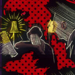
Bennet Pimpinella brings his cinematic art to the What’s in a Lamp? project. Through his signature technique of scratching directly onto film, he transforms Foscarini lamps into symbols of emotions and memories, crafting intimate scenes infused with a surreal, grunge atmosphere.

Mattia Riami’s series of illustrations for the project “What’s in a lamp?” transforms Foscarini lamps into magical objects using a touch of surrealism and fantasy to shift perspectives and bring a sense of wonder to everyday life.
Antje Damm integrates Foscarini lamps into enchanting matchbox dioramas portraying home stories within the limited space of a matchbox in her series for Foscarini “What’s in a Lamp?” project.
In this series from the social editorial project “What’s in a Lamp?” Lee Wagstaff’s geometric patterns reveal more than meets the eye, as alternate realities emerge beyond the surface and fairy characters and tales come to life within Foscarini lamps’ shapes.